A first glance: year-to-date graphs of :
- GDX, Van Eck's large-cap Gold Mining ETF,
- GDXJ, Van Eck's junior Gold Mining ETF,
- SIL, the Global X Silver Mining ETF,
- GLDX, the Global X Gold Explorer ETF.
(Click on the graphs to enlarge)
First observations:
For all ETFs the May and July double bottom can be identified. What differs is the height of the late May-early June recovery, the intensity of the August-September rally and a varying deception to the October "mid-rally" precious metal correction.
- By the look of it, SIL, the silver miners ETF, seems to have recovered very well and is challenging its highs attained during the Jan-Feb precious metals rally. Moreover, SIL has shown resilience during the October silver correction, hardly quoting below its September high.
- GDX recovered well between the May and July bottoms and rallied nicely during the August-September recovery of precious metals. It did suffer during the October precious metal correction.
- GDXJ has disappointed recovering less than hoped for late May and June, dipping early and more deeply during the July double bottom and dragging along until the recovery set in. GDXJ equally suffered during the October correction yet managed to contain the loss.
- GLDX has performed poorly throughout 2012, dipping relentlessly during the correction leading to May, recovering poorly during the late May-June run-up and showing less vigor in its August-September rally. By mid-Sept GLDX peaked considerably below its February maximum. Moreover the gold explorer ETF has suffered significantly during the October precious metal correction.
GDXJ and GLDX versus GDX
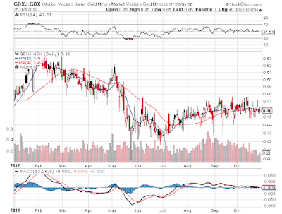
We now use GDX as a benchmark and plot GDXJ relative to GDX, first year to date:
... and next over the long haul (weekly observations)
 |
| GDXJ relative to GDX, weekly observations. The 50 dma is emulated by a 10 week moving aveage; the 200 dma is emulatied by a 40 week moving average. (click to enlarge) |
GDXJ started 2012 outperforming GDX, its gold mining major peer. The relative outperformance peaked with precious metals rallying towards end February. GDXJ lost momentum later on, underperforming GDX. Depite short lived valuation rise end April, GDXJ fell off a cliff in May, not quite picking on with the intermediate miners recovery mid May and marking a deep intraday low. The GDXJ/GDX ratio does rise a little by the time the intermediate miner recovery has run its course by mid June. The relative valuation ratio does recover during the August-September gold rally, proving junior miners to outperform gold mining majors. During the October correction, GDXJ and GDX have been suffering equally. Several intraday swoons of GDXJ/GDX prove that the junior miner ETF is prone to a higher volatility, which may result from its premium or discount fluctuating more erratically. The GDXJ ETF contains many more miners than does GDX, moreover the top ten holdings contribute for much less of the total market value than what you find for GDX. Yet GDXJ doesn't seem to reap any benefit from this in terms of a reduced volatility. The correlation among the fluctuations of its core holdings is far too high for the diversification to have such benificial effect.
Over the long haul the picture gives a different impression: the junior miners in GDXJ have dramatically outperformed gold mining majors late 2009 and especially in the second half of 2010. See for example: Junior precious metal miners outperform or "A junior gold mining index".
The situation reversed in summer 2011 when junior miners started losing their edge and underperformed gold mining majors during most of the entire 18 months miners slump. See also:
And we repeat the exercise for GLDX/GDX
All of this doesn't bode well: after its March 2011 peak, GLDX has almost continuously been declining relative to GDX. After the plunge in Sept-Oct 2011, GLDX seems to uphold better. On the daily graph, a recovery in Jan-Feb 2012 is observed. When looking for it in the weekly graph,(observations since the launching of GLDX) this recovery is almost drowning in the volatility noise. GLDX dropped once more relative to GDX on the last leg down of the miners slump leading to mid May 2012. However, it hardly seemed to benefit from the recovery. Moreover the October 'mid-rally' correction of precious metals again proved a difficult period for gold explorers.
Over the past two years, I have repeatedly reported on GLDX. A first posting was rather analytical, as GLDX only had a very short track record, which initially seemed promising. GLDX was indeed launched when - with hindsight - the gold explorer rally was nearing its end. In a second posting, I was more cautious and have been since then.
- GDXJ or GLDX: What to choose in the gold explorer realm?
- GLDX the proof of the pudding is in the eating.
- No mercy for gold explorers.
- Gold explorers have a long way to go.
Considering the 95% of gold explorers which -according to Brent Cook- won't ever make it to develop an economicly viable gold deposit, the GLDX approach is intrinsically flawed. Moreover with every buy-out (and there have been a few) the potentially best explorers are leaving the selection. What is left has an even higher probability of pertaining to the unfortunate 95%. Note however that Brent Cook's 95% refers to early stage explorers (start-ups). Since GLDX is geared towards the larger (up to mid-cap) explorers, the odds are more favorable, but at the same time valuation is less attractive.
GDX versus SIL
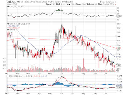
Knowing that the Gold/Silver ratio is a frequently shown yardstick in estimating where silver may be heading to, we now compare the GLD/SLV bullion ETF's to their mining equivalents: GDX/SIL. Both are YTD observations only.
The gold to silver ratio is falling abruptly during the precious metal recovery in January and February. Silver had been beaten down relentlessly late 2011. Its recovery was more vigorous than was that of gold. From barely above $26 on Dec 29 of 2011, silver rallied well over 40% to a fix of $37.23 on leap day. The much more touted gold recovery during that time stretch only amounted to 16.2%. Yet silver had run its course and started weakening relative to gold, not only during the gold retreat towards mid May, but even during the intermediate late May - early June gold recovery and throughout the July doldrums. As gold started rallying from mid August onwards, silver again dramatically outperformed gold. The recent correction was again more felt by silver than by gold investors. The typical observation that "silver is like gold on steroids" is hereby fully confirmed.
For the GDX to SIL ratio, we might expect a similar graph profile. However, this is only partly true. Silver miners do indeed outperform gold miners in January-February as silver leaps its 42%, leaving gold behind. During the subsequent weakening of gold and the more pronounced slide of silver, miners of the white metal are less affected. The miner slump hits major gold miners full fledge as gold corrects. Despite the metal sliding, silver miners are less affected. However as silver is left behind when after mid May gold starts its intermediate recovery, silver miners end really beaten up. Yet again the silver miner recovery (even from June onwards) anticipates that of the gold to silver ratio. It continues as silver outperforms gold during the August-September rally. Moreover, silver miners are once more less affected during the recent October (mid-rally) correction, despite silver selling-off more than gold. Apparently silver miners and mining investors have learned to live with the extreme volatility of the price of the metal.


No comments:
Post a Comment